I probably made my first foray into surface design for clothes when I was kid - in fact, I know I did. My art supply box had just as many colors of puffy fabric paint as it did Crayola crayons. And every year in elementary school, we spent a whole day decorating Christmas tree sweatshirts in puffy paint and pom-poms to wear during the holidays. Later, as a teen, I’d paint personalized placement graphics (you know, my name, my zodiac sign, lol) on tank tops I’d made while learning how to sew.
But I didn’t truly get a sense of what textile design was until I took a class in the fashion design program at Drexel with my professor and advisor (and now colleague!) Kathi Martin. There I learned all about repeats, colorways, conversational prints, and of course, the enduring importance of florals.
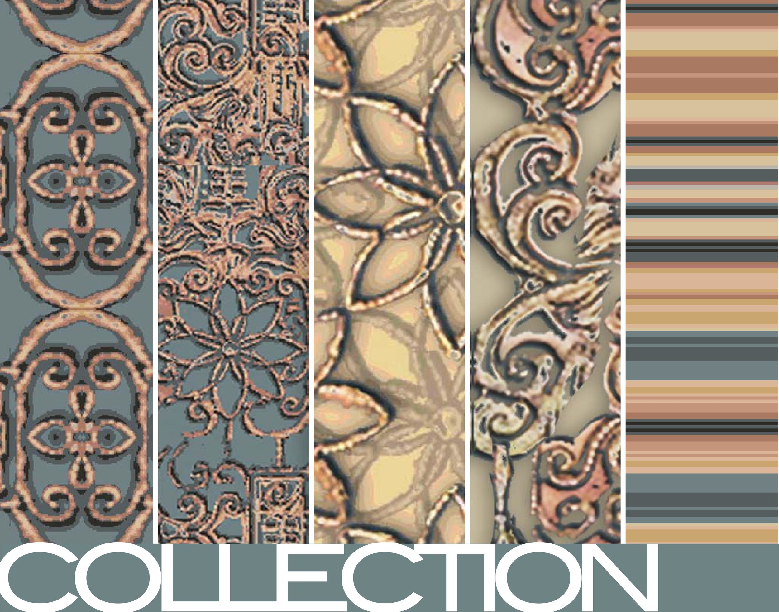
One project challenged us to manipulate inspiration photographs into pattern designs. So on a visit home to my childhood home in Pittsburgh, I took photos of the unusually ornate light fixtures. They always stuck out in an otherwise modest 1920s house -- plus, I’ve always loved the look of filigree.
Back in Philadelphia, I experimented both in Photoshop and another textile design program (that I regrettably can’t recall the name of!) to create mirroring and kaleidoscope effects with my photographs. The result was a collection of prints in a palette of deep, muted teals, gold, creams and warm browns.
I had so much fun with this collection (and loved the color palette so much!) that when it was time for my husband and I to move into our first apartment, I had one of the patterns printed on durable canvas to reupholster the dining room chairs we found in a thrift shop. (Sadly, those chairs were already extremely old and didn’t make it with us to the new apartment four years later. RIP.)
It still have some of the fabric, which I printed with Spoonflower, lovingly tucked away in my home fabric closet. It might be fun to use to create some pouches, or maybe even a tote! It’s always fun to make something new out of an old project.


